I used this photograph to test and set up my printer because it contains so many of the things I want a photographic print to get right. There is a whole counter of oranges, a red sweatshirt, blue plastic crates, green leaves, several faces, deep shade and a bright patch of sunlight. It is a busy market scene, but that is precisely its value. A print can look quite convincing when it has only one dominant color and an uncomplicated background. This photograph gives me several different things to judge at once, and they all have to work together.
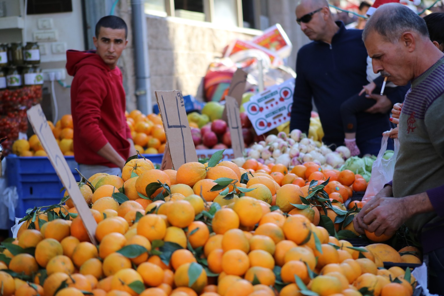
The oranges are the first thing you notice. They fill most of the lower half of the frame, spilling toward the edges in a loose mound, with dark green leaves and little stems still attached to some of them. But they are not one uniform orange. Some are pale yellow, some have a deeper reddish warmth, and others carry greenish patches or small blemishes. The fruit around the middle of the frame has visible texture, while the nearest oranges fall out of focus. That combination is useful: I want the print to preserve differences between neighboring fruits without turning the entire counter into a single slab of oversaturated color. The temptation to make it all look juicier is real, admittedly, but more saturation is not automatically a better print.
The young man on the left adds a second demanding color. His red hoodie stands out against the blue crates and the shaded storefront, with folds that move from brighter red into darker maroon. If the red becomes too heavy, those folds start to disappear. If it becomes too bright, the sweatshirt takes over the picture. The crates provide a different check, with their cooler blue surfaces and dark recessed edges, while the leaves scattered across the fruit give me greens to compare against both warm colors. This is why I like using an everyday photograph: color relationships matter as much as the strength of any individual color.
Then there are the people. On the right, a gray-haired man leans over the stall, a cigarette at his mouth and his hands around a piece of fruit. His gray top has fine stripes across the shoulder and a darker band around the lower part. Behind him stands a man in sunglasses and a dark navy jacket, while the young man’s face on the left sits partly in shade. These faces and hands give me familiar reference points. A small unwanted color cast can be easier to notice in skin than in an orange, because an orange can plausibly be several different shades. I want the people to remain believable, with the differences in their lighting intact.
The dark jacket is particularly useful for judging the shadows. It should read as dark fabric with some shape and separation, rather than an empty black silhouette. At the other end of the picture, sunlight washes across the pale wall behind the stall. Between those extremes are the brown cardboard price signs, the white and pinkish bulbs piled at the back, printed produce boxes and a translucent shopping bag. None of these is a calibrated neutral reference, and I would not use them to measure color accuracy. They do, however, help reveal whether the whole print has drifted too warm, too cool, too dark or too flat.
I also like the photograph’s mixture of sharpness and softness. The rough edges of the upright cardboard signs, the handwritten prices, the orange peel and the leaves offer detail to inspect. The softer foreground and background provide a check on restraint. Printer setup should not become an attempt to manufacture detail that the photograph never contained. I want the focused areas to feel clear and the out-of-focus areas to remain gentle, without hard outlines or an aggressively sharpened look.
There is a limit to what this kind of test can tell me. A familiar photograph helps me judge the appearance of a print; it does not replace a nozzle check, an alignment test or a measured printer profile. The paper and the settings used for it matter, too, and a print needs to be judged under sensible, consistent lighting. An excessively bright screen can make a perfectly reasonable print seem disappointing by comparison. For adjustments to mean anything, I need a stable reference and a clear idea of what I am evaluating, rather than changing several settings simply because the paper does not glow like a display.
That is ultimately why I chose this frame. I can move my eyes from the oranges to the red hoodie, from the faces to the dark jacket, and from the blue crates to the sunlit wall. Each part asks something slightly different of the print. When those parts hold together, the photograph keeps its sense of an ordinary moment at a crowded fruit stall. That is what I want from the printer: the colors, light and small details that made me keep the photograph in the first place.